 By Lee Eugene
Step into a north-facing room at mid-afternoon, and the atmosphere can feel distinctly chilly. Unlike south-facing spaces that bathe in continuous, golden sunlight, rooms with northern exposures receive only indirect daylight. In the Northern Hemisphere, this illumination is filtered through the upper atmosphere, lending it a persistent cool, bluish-gray cast. Shadows in these spaces linger longer, contours soften, and architectural details often appear flattened.
When homeowners try to brighten such rooms using standard decorating instincts, frustration usually follows. The most common instinct—slapping a coat of brilliant, stark white paint on every wall to maximize brightness—frequently backfires. Instead of feeling airy and expansive, the room ends up looking dingy, institutional, and cold, resembling an unheated basement under an overcast sky. Warming up a north-facing room requires understanding how cool ambient light interacts with paint pigments, and intentionally selecting shades engineered to counter that natural chill.
The Science of North-Facing Light and Pigment Chemistry
To choose the right paint, you have to understand what northern daylight does to color. Light is not neutral; it carries a distinct color temperature measured in Kelvin. Direct southern sunlight registers at a warm, amber-leaning temperature, while indirect northern light registers high on the Kelvin scale, projecting a crisp, steel-blue wash across your walls.
Because northern light already carries a blue foundation, any paint containing cool undertones—such as icy grays, slate blues, crisp greens, or stark purples—will have those cool qualities exaggerated. A light gray that looks refined on a sunny paint chip will quickly read as concrete or wet clay on a north-facing wall.
The secret to neutralizing this effect lies in pigment undertones. To offset cool blue daylight, your paint must contain warm pigments: yellow, red, orange, or ochre. These underlying warm notes absorb the coolness of the ambient light, preventing the space from feeling clinical.
Another key concept is Light Reflectance Value (LRV), which measures the percentage of light a paint color reflects on a scale from 0 (absolute black) to 100 (pure white). While conventional wisdom suggests using a paint with an LRV above 70 to reflect maximum light, in a north-facing space, a high LRV without adequate warmth merely reflects shadows. The goal is not simply to bounce weak light around, but to infuse the room with warmth that the sun fails to provide.
Warm Off-Whites and Creams: The Antidote to Stark Gray
If your goal is a light, breezy backdrop that still feels welcoming, step away from gallery whites and embrace complex, creamy neutrals. The right off-white for a north-facing room needs enough yellow or peachy pigment to counteract the natural gloom without looking overtly buttercup yellow.
Linen, Alabaster, and Whipped Creams
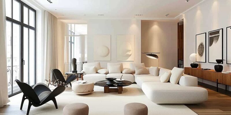
Look for off-whites anchored by yellow-gold and beige undertones. These shades read as clean, luminous whites in northern light because the blue daylight naturally neutralizes the yellow warmth, balancing the color into a soft, inviting glow. Think of heavy cream, steamed milk, or bleached parchment.
When tested on a wall, an off-white that appears almost slightly too yellow under the artificial lighting of a paint store will often look like the perfect crisp, inviting neutral once applied in a north-facing bedroom or home office.
Subtle Peach- and Pink-Based Whites
Another effective route is an off-white with faint red or blush undertones. Soft pink and peach bases emit an unmistakable radiance that mimics the glow of late afternoon sun. In northern exposure, these undertones never scream pink; instead, they wash the perimeter in a subtle, flattering blush that softens harsh shadows and flatters human skin tones.
Earthy Mid-Tones: Grounding the Space with Cozy Depth
Sometimes a room is simply too shaded for white paint to ever feel cozy. In these instances, stepping into mid-tone neutrals provides the visual weight necessary to keep the room from feeling washed out.
Muted Terracotta and Warm Plaster
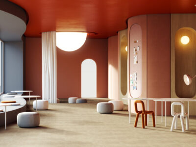
Earthy clays, dusty peach, and muted terracottas are extraordinary performers in cool light. Because red and orange are the direct chromatic opposites of cool blue and gray, these tones work actively to heat up the visual temperature of the room. A soft, chalky terracotta does not demand high natural light to look rich; it creates its own warmth, transforming a drafty dining room or library into an intimate haven.
Caramel Taupes and Mushroom Browns
If you prefer a contemporary, neutral scheme, bypass standard cool grays entirely and opt for warm greige, caramel taupe, or rich mushroom. These shades are mixed with yellow and red oxide pigments rather than black and blue bases. They create a velvety, cocooning backdrop that feels tailored and serene. A mushroom brown paired with warm ivory trim provides depth, allowing art and furnishings to stand out without relying on harsh contrast.
Saturated and Moody: Embracing the Natural Shadow
One of the most liberating approaches to decorating a north-facing room is abandoning the fight for artificial brightness and leaning into drama. When a space naturally lacks sunlight, attempting to make it look like a sun-drenched sunroom can feel forced. By choosing deep, saturated colors, you transform an otherwise shadowy room into an intentionally dramatic and cozy sanctuary.
Deep Forest and Mossy Olive Greens
Green bridges the gap between cool tranquility and organic warmth, provided you select varieties heavy on yellow undertones. Avoid mint, seafoam, or blue-tinged eucalyptus, which turn bleak in indirect light. Instead, gravitate toward rich moss, deep olive, or forest greens laced with ochre. In a dimly lit den or powder room, olive green feels organic, grounded, and inherently restorative.
Spiced Ochre and Mustard
Yellow can be tricky, as bright canary yellows can become jarring or discordant under cool light. However, deep, antique ochre and spiced mustard tones contain enough brown and red pigment to anchor the brightness. In a northern room, these colors evoke the feeling of candlelight, creating an inviting, academic elegance that feels deliberate and warm.
Enveloping Navy and Charcoal with Warm Bases
Dark colors can work wonders when handled with care. A navy with a touch of violet or red, or a charcoal infused with espresso undertones, absorbs the cool cast of northern light and turns shadows into intentional visual depth. When you pair dark walls with warm wood furniture, brass hardware, and plush textiles, the absence of direct sunlight becomes an asset rather than a liability.
Perfecting the Finish: Sheen and Lighting Synergy
Selecting the right hue is only half the battle; paint finish and artificial lighting determine how that color behaves once it dries.
Selecting the Right Sheen
High-gloss and semi-gloss finishes reflect light directly, but in a room dominated by cool shadows, that reflection can look harsh and highlight surface imperfections. For north-facing walls, matte, flat, or low-luster eggshell finishes are universally superior. These finishes absorb and scatter light softly across their surface, creating a velvety texture that dampens glaring reflections and softens shadows.
Calibrating Your Artificial Lighting
Paint never exists in a vacuum. Because north-facing rooms rely heavily on supplemental artificial light throughout the day, the color temperature of your light bulbs must support your paint selection.
Avoid daylight bulbs (4000K to 5000K), which cast an icy commercial glare that exacerbates the northern chill. Instead, outfit fixtures with warm white bulbs between 2700K and 3000K. This color range introduces amber tones into the air, activating the warm undertones of your paint and creating an inviting environment long after the sun goes down.
A north-facing room does not have to feel like a cold storage locker. By working in harmony with its unique, indirect daylight rather than fighting it, you can create a space defined by sophistication and comfort. Whether you introduce radiant warmth through an alabaster cream, ground the perimeter with a velvety mushroom taupe, or wrap the room in the moody embrace of spiced ochre, the right paint transforms cool northern light from a design obstacle into an enduring asset.
What is your reaction?
Excited
0
Happy
0
In Love
0
Not Sure
0
Silly
0